I've been dipping my toes into ultimate recently, and while I could of course comment on the gameplay, mechanics, characters, and everything else of that nature, I'd actually like to instead take a moment to comment on the (lack of) visual readability that I'm experiencing in the game.
There was a substantial shift in how knockback works in Ultimate when compared with other smash games. To illustrate, lets first look at a high knockback scenario in Super Smash Bros. Melee:

Nothing special here, Luigi gets hit by the Falcon Punch, gets sent flying, and travels for over a full second before his momentum stops and he can start drifting back to the stage. Even though Luigi gets sent an entire screen distance (roughly the length of FD), it's still very easy to track.
Now let's look at how knockback works in Ultimate:

In Ultimate, knockback velocity is very nonlinear -- instead of traveling at a constant speed, you travel REALLY fast initially, and then slow down dramatically after a little bit, like you're an inflated air balloon with a lot of drag.
Notice how much more jarring this effect is. In particular, pay attention to how Sonic's initial knockback velocity is SO fast that he goes off screen for a moment before the camera does a massive readjustment.
This is significantly harder to track, and that's not just my personal opinion:
"According to a translation by Source Gaming, Masahiro Sakurai considered applying this change to knockback during Super Smash Bros. 4's development. He concluded that it would've been too difficult to keep track of the launched fighter on the small 3DS screen." (source)
This is the reason why in Ulimate we have these large obnoxious smoke trails every time you get sent flying. The smoke trails at least provide a visual path for your eyes to follow as you try to relocate your character again. But what if you are in a 2v2 or FFA situation and multiple characters get sent flying at the same time?
I'm assuming that the change to knockback was done for gameplay reasons, or for "visual cool" factor. The big smoke trails certainly look "cool", but it's a real problem when every time a high knockback move hits I lose track of one (or more) characters. I'm not even sure which direction to hold on my control stick when this happens because I'm not sure which end of the screen I ended up on.
Character Visuals
It's pop quiz time! Let's look at some screenshots of standard 1v1 matches. In each of these matches, one player will be using a RED character costume, and their opponent will be using the same BLUE character costume of the same character. Your exercise is to figure out which player is on the LEFT side of the screen and which one is on the RIGHT side of the screen. Got it?
Here we go! Let's start with this one:

Too easy? Okay, sure, you're right. DK's entire body may as well be colored in bright paint, so of course he stands out clearly (hint: many of the characters in smash 64 are like this). Let's try a more difficult character, and I'll even reduce the size of the screenshot.

...but this was relatively easy too, wasn't it? Not only is his entire body tinted, but each one of them has a distinctive, uniformly consistent colored party hat that you can easily reference to figure out which color they're associated with.
Okay, now what about this one?

One of these Falco costumes is "red" and one of these Falco costumes is "blue". Can you tell which one is which? Because I sure as hell can't. These two costumes are supposed to be contrasting primary colors, yet they look virtually identical. I kid you not, this is literally from a highlight video that I was watching earlier this afternoon. The blue falco is on the right, by the way, though both of them have red shoes and share the same white jacket. I'm sure the front side of blue falco's jacket is probably tinted a little differently.......not that I can actually see it since it's not facing the camera. See the problem?

There is a ton of detail crammed into these characters (not that I can see most of it in the screenshot above since the lighting is dark), but somewhere along the way we lost a strong silhouette and color keying. These two things are why pixel art and 2D art in general (when done well) are such a strong visual language for games: because it reads so clearly and consistently. As a game player, I need to be able to take in an image and break it down into contrasting blocks of color to read what is going on.
Let's try converting the image from before into grayscale and blowing up the contrast:
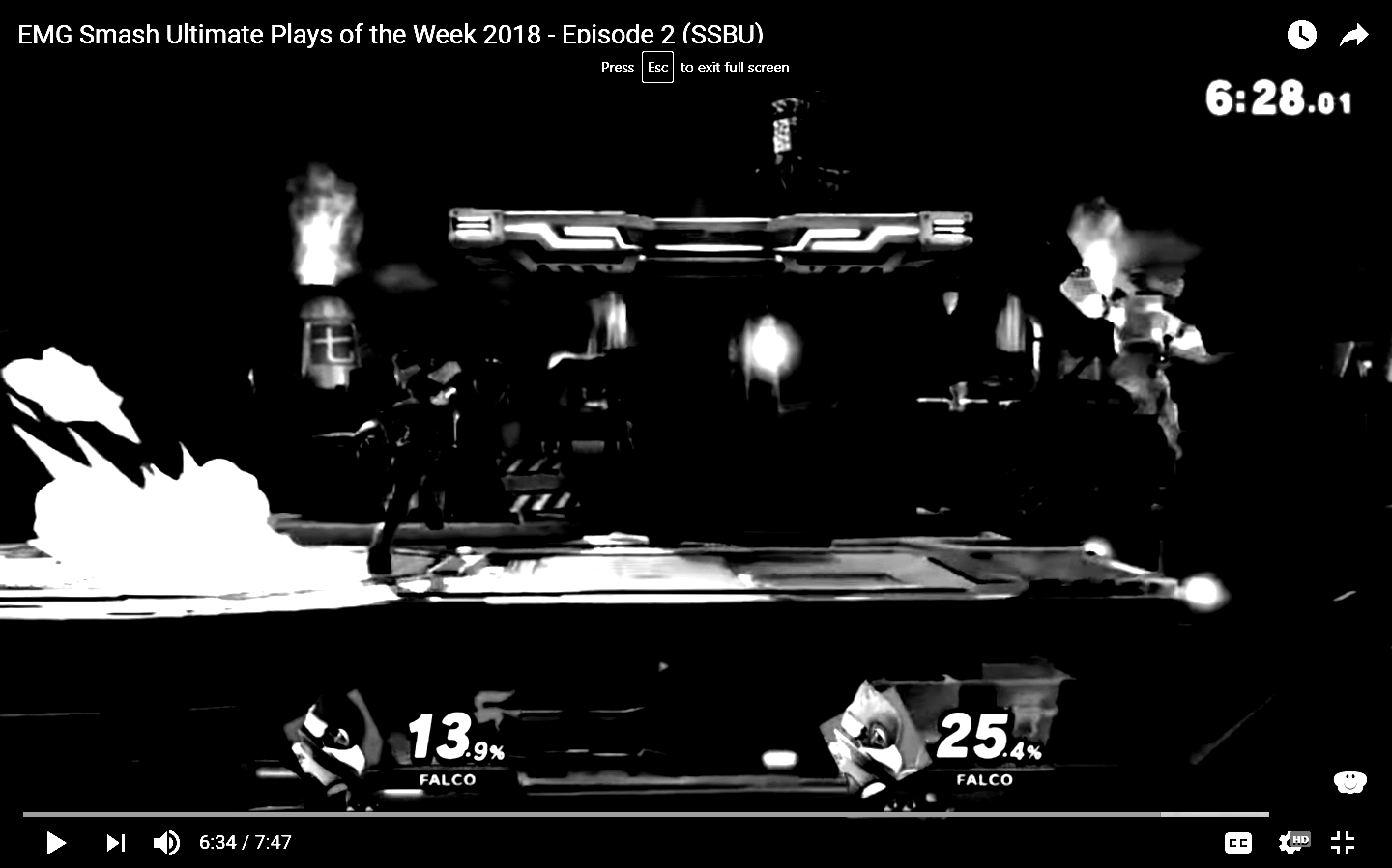
Notice how there's some very good effort being done to make sure that the stage itself is readable. From a quick glance at this image it's immediately obvious where the main stage and platform are because there's a nice fill light on the flat portion of the stage, along with a horizontal neon light on the side of the platform. Nice!
But look at what happened to the characters themselves. Falco on the left is blending into the shadows, while Falco on the right is blurring into the Mako reactor in the background. These characters are THE most important thing in the game, yet it's impossible to read a clear silhouette from them. If I'm looking at this image the only thing that really stands out to me is a BLINDING WHITE CLOUD OF SMOKE that tells me that someone is starting a dash...
Don't even get me started on trying to differentiate two similar characters on the same team, or when Inkling paint gets into the mix...
"But DDRKirby! Of course the lighting is going to be bad, you picked a super dark stage for your screenshot!"
But see, that's the thing -- Smash 64 doesn't HAVE these sorts of lighting problems -- the characters look great on all the stages (okay, maybe not on Kongo Jungle, but that one is the exception to the rule). But you know what, since you asked, let's try a brighter stage in Smash Ultimate!
There are 4 different characters in this Smash Ultimate screenshot. Can you find them all?

When I tried this exercise myself, my eyes went to the dark black smudges at the bottom of the screen ("is somebody exploding in the middle of there?"), briefly thought that Toon Link's portrait was a character in the game ("oh, it's just a ui element"), and wandered around before finally realizing that Inkling wasn't just part of the tree in the background.
Does adding back in the colors help? Well.....

....sort of. At least Inkling stands out against Whispy Woods (the tree) now. But there's no focus to the image here. Colors are just everywhere and my eyes really don't understand where I am supposed to be looking. Try squinting your eyes and looking at the image. Can you make out anything that's going on?
Now let's look at a 4-player match in Smash 64:
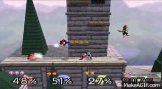
This image is ridiculously low quality (please excuse the watermark). Yet it's much easier to tell where the 4 characters are, even if you squint your eyes. Why? Well, that brings me right to my next point...
Stage Visuals
Just as important as the character designs, palettes, and silhouettes, are the background against which they are set. In the above two images, notice how much more subdued and desaturated Hyrule Castle is compared to Green Greens. In fact, the background of Hyrule Castle has a blurry "haze" effect that makes Fox stand out extremely well. Meanwhile, in Green Greens, color, saturation, and detail is EVERYWHERE in the background, so the characters don't stand out nearly as much.
Let's look at some more examples to illustrate the point.
Here's Battlefield from Super Smash Bros. Melee:

Very clear definition -- the platforms are again highlighted -- and even though there's a weird glowing orb thing on the bottom of the stage, it's not distracting because it's on the underside of the stage -- which is usually not in view! The background uses smooth dark gradients so that the characters will stand out against it.
Here's Battlefield from Smash Ultimate:

It looks gorgeous. But good luck finding your fighter in the middle of all that mess, particularly with that giant ice sculpture thing on the right there.
See the trend? We have all of these detailed stages with tons of color and contrast everywhere, which looks great, but greatly hurts readability.
And it's not just Battlefield. MANY stages have received the same treatment, where everything is brighter, more contrasty, more detailed, and generally more busy.
Here's Mushroom Kingdom in 64 vs Ultimate:

Peach's Castle is more of the same -- again, everything just got brighter and more contrasty:

And let's not forget Venom, where all of a sudden the most eye-catching element of the stage is GIANT LAVA IN THE BACKGROUND that has no bearing on gameplay:

I'm not saying that you can't have interesting, beautiful, detailed backgrounds. It's just that those backgrounds need to be designed with readability in mind. In fact, the Battlefield version of Fourside in Ultimate actually manages to execute this perfectly:

Look at all that gorgeous detail in that background! And yet, the platforms and main stage are super readable, and the (well-lit) characters pop out instantly against the dark night sky. This is what readable stages should look like.
Anyways, that's the end of my rant. I'm always disappointed when higher fidelity graphics and technical capabilities end up leading to worse visual design (Street Fighter IV and Starcraft 2 come to mind) and I haven't seen anyone really talking about it with regards to Smash in particular, so hopefully this post illustrates my feelings effectively. Again, don't get me wrong -- Smash Ultimate is definitely a beautiful game -- it's just that I think more care and attention needs to be paid to these sorts of readability issues, especially for a fighting game whose primary strength has always been ease of play for newcomers.
Tuesday, December 18, 2018
Smash Ultimate's (lack of) Visual Readability
There have been quite a number of times that I've been visually confused by what's going on as I play Ultimate. Losing track of my character position in a 2v2 team battle, confusion over items and projectiles and in more general terms a sense of visual overload from what is going on on the screen. At first I reasoned that this was just because I was unfamiliar with the characters, movesets, projectile types, and items, but after thinking about it some more, I realized that it's simply because the game is way harder to read visually.
There are a few big reasons for this, which I'll try to illustrate in visual form since that will be the most helpful to understand what I'm talking about.
Balloon Knockback
Subscribe to:
Post Comments
(
Atom
)
Readability is indeed super-important in many types of game. I've seen it repeatedly missed by teams doing a port or with little experience on platformers, but that's the first time I hear that such a big title has such big flaws... Pretty unfortunate.
ReplyDeleteI wanted to write something exactly like this but you did it first and very well. I agree wholeheartedly with you. I love ultimate and the stage variety but I'm already working on a ban list of stages just because they hurt my eyes playing on them.
ReplyDeleteThe game is really pretty, too pretty for it's own good.
In the words of Masahiro Sakurai himself on how he wanted the stages to be developed in Super Smash Bros Melee.
ReplyDelete(Source: https://www.sourcegaming.info/2016/04/17/melee-battlestages/)
"The characters have to be easy to identify. Characters tend to be pretty small in Smash, so we can’t make the background colors too pronounced or prominent, or it’ll make the characters hard to see.
Platforms that can be stood on have saturated colors, parts that can’t be stood on have unsaturated colors."
If only they followed that mentality making Ultimate...
I happened upon this post specifically because I was looking for an explanation of why I found it so hard to track characters in Ultimate and I think you've hit the nail on the head. I find Dream Fountain's updated look to be so bright and gaudy that characters blend into it far more than they did in the Melee version. It's a shame that more people don't discuss this, because it's a legitimate issue with an otherwise excellent game, and I think it could be corrected (at least somewhat) by releasing a patch that adjusts the contrast of the colors in the backgrounds of the stages that are the worst offenders.
ReplyDeleteThis article explains a lot. I thought it would touch on the 2D visual effects that it now has but it actually touched on the stages which is a lot more important. I think the 2D visual effects are well animated and look great but are just too many and distracting. Sometimes I don't even know what the character is doing behind the visual effects. It just looks like that goofy cartoon effect where characters are fighting in a dust cloud and you've got no clue what they are doing inside.
ReplyDelete