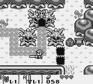
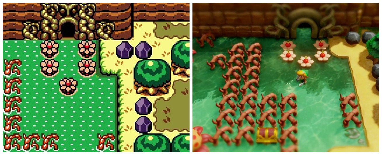
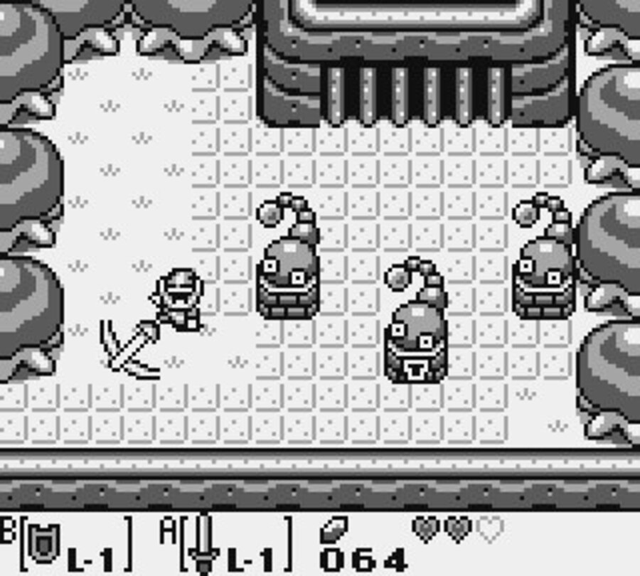
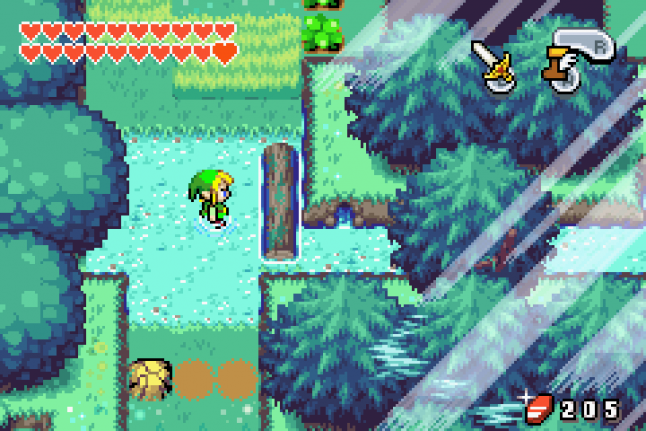
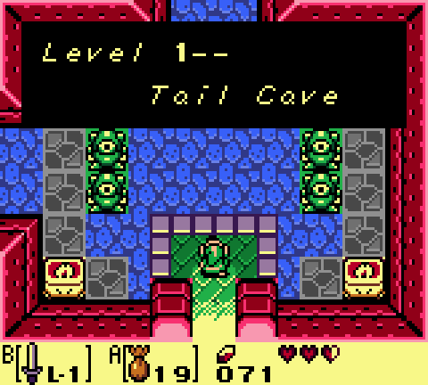
I watched a tiny bit of the gameplay in the Link's Awakening remake for switch (2019). It's an interesting little thing that...exists, I guess. I feel like they really made the right choices to make this one appeal to people. Which is not to say that I agree with most of the decisions, but I think that the one thing the remake does obviously well is sell itself to its audience. It's got this aesthetic that's filled with [cough] bright saturated colors, and makes you go "aw, that's cute". I think that's the goal -- "this looks so cute, colorful, and refreshing!" When I searched for material comparing the remake to its predecessors I found a lot of comments on the added quality-of-life features, extra content, and small changes made to the game content here and there, as well as the feel of movement and combat. I can't really speak to that last point confidently, not having played the game, but I think I'm honestly less interested in any of the other parts because I think there are two elephants in the room that you have to discuss. The first is the idea of seamless overworld navigation (as opposed to screen by screen). It isn't necessarily a "bad" thing to have this, I think it actually is quite a clever idea since it fixes several issues at the same time (dealing with a widescreen aspect ratio, for example). But this is perhaps the most jarring design aesthetic that you can point to, coming from the original. The entire world of Koholint was designed around small screen real-estate in such a way that each screen uses tiles "efficiently" to paint a picture, to serve one main idea. ChevyRay mentions this in their Ikenfell design language article. You can't just see "no more screen transitions!" as a strict upgrade, because it really isn't. Each screen being distinct makes it into its own little mini story. You get to =remember= locations better because you associate the entire screen as a visual silhouette. Of course, I'm sure the in-game map functionality in the Link's Awakening remake is much better. It probably =needs= to be, because the world was carried over one-to-one from the original, and the original was not designed to give you visual landmarks to help you find your way! At least, not in the traditional sense. In a game with screenless navigation, you (hopefully) have these sort of large "land features" to help you orient yourself to where you are. A tower here, a big rock there, maybe a lake. But in the language of Koholint, screens are differentiated by their patterning. "This is that screen with the four trees in the corner", you might subconsciously think. But of course, you're probably not going to remember "a set of four trees" as a signpost in the remake because that shows up all over the place and there's nothing special to set them apart. Everything is positioned relative to everything else. Seamless overworld scrolling just operates under a different set of orienting principles. Like with everything, this isn't strictly a BAD change, necessarily. The original Koholint overworld was honestly quite labyrinthine at times, and I think simply navigating through it with a detailed map does probably ease the experience in some ways. But you do also lose something in that process too, right? Think about navigating through a town using google maps, versus having to do it on your own by sight. You might be taking the same path, but you're perceiving things in a very different way. It's an important difference, regardless of which option you prefer. I could talk about the faux "depth of field" effect at the top of the bottom of the screen which didn't seem to bother me at first until I started noticing it more and more...but I won't. Instead I'm going to talk about the color palettes and visual focus in this game because oh boy, do I always have words to say about visual readability. The surprising thing that I'll say here is that when you look at a side-by-side, I actually think the remake does pretty ok on visual readability from some spots that I've seen. Honestly a lot of the screens read better when compared to Link's Awakening DX.....kinda. ...Sigh, I WAS going to say that, but even in the process of looking for random screenshots, I already start to see the issues... One of these issues is that....everything in the overworld is seen from this camera angle, with this specific directional lighting, which means that all of the significant elements that happen to be embedded into walls (i.e. every dungeon entrance) are all.....just dark and bathed in shadow. (The grass is also =incredibly= noisy, but we'll get to that later) You can see the same thing happening here on the right with this dungeon... Doesn't really help that now the dungeon entrance is -- in addition to being darkened -- also blurred out by the postprocessing effect. Aiyee..... The other thing I wanted to comment on, though, is that in ALL of these examples there is a decided lack of visual focus. EVEN the Link's Awakening DX screenshots. And that's because (incoming hot take) I think Link's Awakening DX has kind of sh*t visual design too. The color palettes add a bunch of saturation and contrast everywhere and mess up all of the values in the tiles and that makes all of the screens really, really busy. As a case study, let's look at the entrance to Tail Cave in all three versions of the game. First the switch remake: I already talked about this above, but again, the entrance to the dungeon is completely in shadow. Not only that, though -- the three "pillars" (the focal point of the screen here) are the LEAST saturated elements in the screenshot here (why are they a dull greenish mud color?) The most attention-grabbing element on this screen is probably the big spiky tree decoration. (Why?) On the bottom of the screen frame you see a big splotch of blue, which of course is visually interesting but totally irrelevant here. Sudden lightbulb moment...is this why they implemented the blur effect at the top and the bottom of the screen??? Was it an attempt to try and reduce the loss of visual cohesion caused by other map tiles bleeding over into the camera area? HMMMmmmmmm......... Now let's look at Link's Awakening DX: It's less "cute", but it reads better, right? The dungeon entrance is clearly visible and the purple hue (while not really coherent with the rest of the colors) serves as a nice unifying and distinct factor -- purple statues link to purple dungeon entrance, nice! The screen size might feel a little small coming from the widescreen aspect ratio above, but do you see how the green trees nicely frame the composition and how the focal point of interest (the keyhole slot) is perfectly framed according to the rule of thirds? This is not a coincidence! The natural thing would have been to just put the dungeon entrance in the middle of the screen, right? But no, the composition has been reoriented this way on purpose! This is the kind of stuff that gets lost when we throw away the division between map tiles... We don't see any of the adjacent screen (to the east of the trees) as we do in the remake, because why would we? It's not relevant to this segment of the map, so it would just be a distraction... But all that said, there are still issues with this screenshot of the game too, right? As I mentioned before, the color palette isn't really that cohesive -- green and purple against reddish-brown...? And the busiest element here is by far the floor tiles, which just should at you to notice this unholy sea of SQUARES EVERYWHERE. Yeech. Now here's how that screen originally looked: Do you see what I mean here? This is by far the best-reading screenshot of the three and it's not particularly close. The square tiles are faintly present, echoing the idea of a tiled brick road without being too distracting. The collision areas are clearly demarcated -- dark means impassible, light means walkable. Even if you look from a distance and squint your eyes, it's extremely easy to piece together the geometry of the screen. There are only four shades of gray being used in the entire image, but it turns out that in order to get away with that you have to be very intentional about your usage of those shades. Somehow, in Link's Awakening, we had more colors to play with, but we used them like this: What happened here? Why does Link's Awakening DX look like it came out of a child's coloring book, where we simply chose each of the brightest and bestest colors and floodfilled all the way with each of them, instead of settling on cohesive color palettes? You know, the kind of colors that we love from good pixel art. Palettes like these: Was it just due to technical limitations? Well...not exactly. The Game Boy Color =is= capable of more subdued color ramps. Just look at this screen, from Oracle of Seasons/Ages -- where we seem to have realized that we can stick to two main colors in a composition, and highlight/shadow them appropriately: But we don't see any of this in Link's Awakening DX. You see, you have to remember that LA:DX was one of the premier titles for the just-released Game Boy Color, releasing in 1998 just in time for the holiday season in December after the console itself was launched a month or two before. The original Link's Awakening originally debuted on the original Game Boy =five years earlier=, and was not only the top-selling game of that year, but single-handedly increased sales of the GB by thirteen percent! And in terms of content, Link's Awakening DX only includes a few more end-game features (some of which were criticized as being lackluster). How are you going to convince people who have already played and beaten the original, to play a remake that has essentially 95% of the same gameplay? That's right, the way you do it is by making BOLD use of color. "Look here! At how vividly you can experience the world of Koholint! If only you buy a Game Boy Color for Christmas....". Part of the "extra content" added to this version of the game was the Color Dungeon, an entire dungeon built with gimmicks around red/green/blue patterns. Because oooooo, COLOR. ...and this strategy worked! With reviews of the game praising it as being "sharp" and adding "vibrant life" to the world, as well as "helping objects and enemies in the environment stand out tremendously". .... ............ sigh.... Sometimes, history repeats itself... Look, I'm not saying that Link's Awakening (2019) is a bad game. It's probably just fine. But when you look at it from these lenses (as I can't help but do), you can start to see the little rough edges. Why are the statues in this entryway GREEN and why do they look so ominous and detailed when they aren't actually interactable? (it's because they're solid green in Link's Awakening DX, see the screenshot above this one) How many new players reach this room and (like the one I watched) assume that there is some puzzle to be solved based on the visual focus that they command? Why do we insist that the cuttable grass in the overworld occupy such a high level of contrast and detail compared to everything else in the screen? Why did we forget about what things can look like, with a little more restraint? Listen to the theme of Mabe Village for me, will you? One of the all-time classic town themes. Soft, gentle, yet with a peppy energy that can put a smile on your face. Why did we take away the soft edges from that village, dousing it instead in a paint job reminiscent of a high-school sports jersey? Maybe we got a remake of the wrong game...


_Screen_Shot_9_24_19%2C_1.33_PM.jpg)






Thursday, November 28, 2024
Link's Awakening, and more ranting on Visual Readability
Subscribe to:
Post Comments
(
Atom
)

No comments :
Post a Comment