Time for another update...
I went camping for the first time over Labor Day weekend! We went down south somewhere in the middle of nowhere, it was...sort of intense. I did about as well as could be expected, with the number 1 nuisance being the flying buzzies that bothered me constantly. I had my earbuds in for most of the day, otherwise I probably would have gone insane...past that, it was stifling hot so we spent a good deal of time in the creek. We had a nice night hike and glowsticking session, which was fun! The clouds were actually covering most of the sky, so we didn't see any stars, or hardly even the moon (which was super bright when it was visible), which was a bit disappointing, but I actually didn't mind much -- to be honest, I thought it was actually really cool being out in the middle of nowhere with not even the stars out, especially since it was so quiet in terms of ambient noise. (And the buzzies were asleep, YAY) It was a special kind of quiet, I think. Anyways, overall a fun trip, though not something I'd be looking to do again, haha. I was pretty drained after coming back home -- it has been a while since I have felt so socially depleted; I remember I really just didn't want to interact with any human beings.
Before that I also went to Crunchyroll Expo! It was fun overall, and very convenient and close to get to -- very laid back, very easy. I'd definitely go again! It's smaller than an event like Fanime, but surprisingly large despite it being only its first year. I brought my Journey cosplay, as I always do nowadays. Here's a photo of me along with this super cool Hyper Light Drifter (!) cosplayer!

By far the highlight was getting to meet the OneShot devs (!!!) who apparently were holding a table at the artist alley!


This week I'm actually taking the week off from work! Taking some time off after working hard for our PAX demo, which seems to have gone down pretty well! As you might guess, I'll be trying to spend the week focusing on more development for Rhythm Quest, music production, hopefully some art, and overall just catching up on things in my life. It's been going pretty ok so far! I've made some good progress on Rhythm Quest and pushed out a new song as well.
My current big focus area for Rhythm Quest is adding a whole new part to the game -- overworld maps!
Up until the beginning of the week, the level selection UI (which, admittedly, was placeholder) for Rhythm Quest looked like this:

Pretty boring, right? (though a lot more exciting than before when it didn't even have stage names) But it works just fine, and is even optimized for touch controls (Rhythm Quest is designed for mobile!) and if you look at my other rhythm games, you'll see that it's the same basic menu template as before. Here's Ripple Runner Deluxe:

...and here's Melody Muncher, which adds a little more detail with level info and high scores:
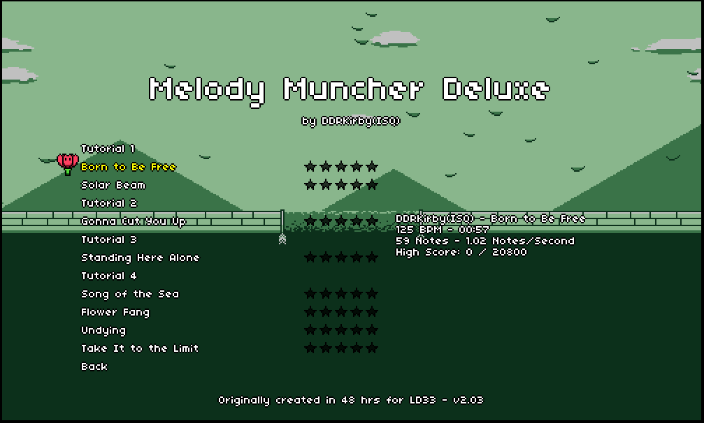
But I really wanted to have more of a sense of progression for Rhythm Quest, especially since, unlike Melody Muncher, there aren't going to be high scores or anything, just a pass/fail, with a special bonus if you clear the stage without dying at all (just like Ripple Runner). I actually think that was one of the strengths of Ripple Runner's design when compared with Melody Muncher -- even though Melody Muncher was a much "deeper" game mechanically, there is a certain simplicity of "have to get this section right" and "one more try!" that I think keeps players engaged, as opposed to the more DDR/Guitar Hero-like mechanism that Melody Muncher uses. Of course you need to be a little more cautious with the difficulty because now you either pass or fail (and failing means not progressing!), but I think there's also a better and more concrete sense of accomplishment after doing a section well.
Anyhow, I wanted to have more of a sense of progression and was throwing around ideas about how I should handle level/world selection (I knew for sure that I wanted to divide the stages up into "worlds" with different themes). I couldn't really come up with any simple menu/ui-based schemes that really felt compelling, so I started thinking about map screens -- and more specifically, ideas that would meet the criteria that:
- They make sense with touch controls (but could work on PC builds as well)
- They provide a clear sense of progression
- And most importantly, they are doable in terms of my artistic abilities
That third point is always the limiting factor for me, as that's certainly my weakest and most time-consuming point in my trio of skills between coding, audio, and graphics/animation. I knew that doing some sort of map system would be testing those skills, but maybe it would be an opportunity for growth! I've actually already gotten WAY better at pixeling over the years than I used to be, after all.
So I started thinking about map screens that would make sense, including some sort of Kirby's Adventure-style platformer-based level selection with doors and a level layout -- which seemed doable in terms of art assets (platformer tiles!) but didn't make too much sense with the rest of the game, and made zero sense to do with touch controls. So I settled upon some sort of overworld map system, with dots or circles that you would tap on in order to select a level. I ended up pulling very heavy inspiration from the Super Mario World overworld map style, which looks like this:

I thought this would be a great fit, as it was roughly tile-based (good -- limiting myself to working with a grid makes things much more structured and easier for me) and the graphics themselves were relatively simple. I could even use the "roads" to mark progression, as SMW did, which would be great!
I had a few false starts, and went back and forth on what to do with my color palette -- Rhythm Quest has an interesting facet of its design where the level tileset is drawn using a 4-color palette, but hue shifts to different colors at different points in the song. This is the same technique I used in both Ripple Runner and Melody Muncher, to great effect -- 4-color monochromatic palettes are an absolute joy to work with for me, as they simplify everything a lot and allow me to really concentrate on values rather than worrying about coloring. It's worth noting though, that as with other aspects of 8-bit style, Rhythm Quest breaks this rule in other areas -- the character and enemies and obstacles and UI, for instance, don't actually fall into the same palette, which makes sense because it's important to be able to still recognize red enemies vs orange enemies, etc. and neither spikes nor the character wouldn't be able to stand out as much if they adhered to the same palette. So it's an interesting mix.
Anyhow, I was really having trouble drawing out a good "Grass Land" map using my 4-color palette that featured a nice green-ish ground color but also had tree tiles and such, as well as a lighter color for the road. I also knew I wanted a lake or river so that level 1-3 could take place over the water. At one point, I decided to throw the 4-color palette to the wind and started drawing up a more expansive color palette, with blues for the water, greens for the grass and ground, and some yellow colors for the road and dirt. I started to try pixeling some trees and such using that palette, and it was going pretty decently well! But then after that I realized that with a few replacements and adjustments, it actually worked just as well (if not better) with the original 4-color palette after all!
Here's what I ended up with:

Again, the blue circles (which are the actual interactable buttons) don't obey the 4-color palette. It's inconsistent, but in a consistent way I guess! Anyhow, I'm really happy with how it turned out so far, and it was a bit of a relief to be honest that I managed to get something workable. With that body of work out of the way, my next task is to actually hook up all the buttons and dialogs (partly done already), and then do a bunch more coding work to get it so that your level progress is saved, and so that the roads actually fill in dynamically like they do in Super Mario World -- that should be really cool once I get it all working!
Wednesday, September 20, 2017
Camping, CrunchyRoll Expo, Rhythm Quest Overworld Map
Official merch omg!!! I fangirled for a while here, looked at all of Nightmargin's cool art, picked out a ton of stuff I wanted to buy from them, and traded contact info (I had one of my spiffy business cards with me, aw yeah!). So cool, I never thought I'd get to meet the devs in person, like they are real people sitting right there on the other side of that table and they made one of my favorite games wahh @_@
Subscribe to:
Post Comments
(
Atom
)
No comments :
Post a Comment